Tips for poster design
Wondering how to design a poster correctly?
Our tips on poster design will help you to inspire your audience. We show you how to bring posters to life with creative design. With our advice, you'll learn how to design posters in such a way that they convey your message clearly.
Poster design rules: 6 tips for poster design
Our six tips for poster design include essential rules for successful poster design.
We present proven principles and strategies that you can use to design posters that will be remembered for a long time.
-
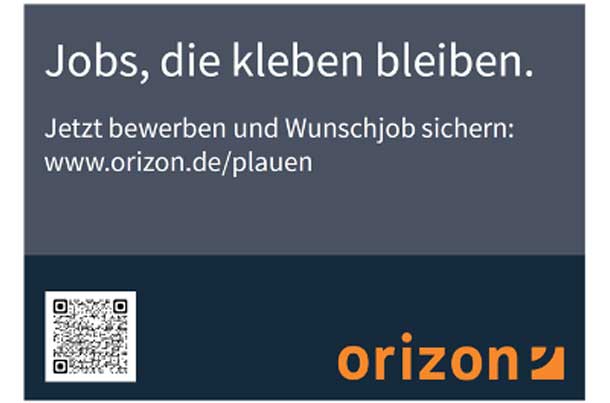
Clear advertising message!
Focused communication to the viewer
© Orizon GmbH
A well-designed poster focuses on clear communication to the viewer.
Posters are primarily seen and noticed by drivers in 2-5 seconds as they drive past.
Your advertising message should therefore be recognizable at first glance.
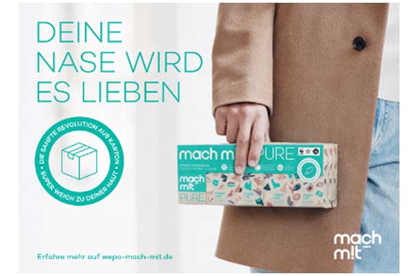
Reduced text!
Reduce the text to the essentials
© WEPA – mach m!t
The font must never be too small. The letters should be at least 5% - preferably 10% of the poster height so that they are easy to read from a distance.
Since the viewing time is normally very short, it also makes sense to use as few words as possible to get the advertising message across.
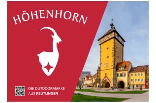
Logo visible!
Make the company/brand logo clearly visible
© Höhenhorn Online-Shop
The company logo should always be well visible placed. A company/brand logo cannot be displayed too large on a poster.
A poster without/with only a very small company logo delivers a significantly lower advertising impact, as the viewer cannot associate the advertising message with a brand/company.
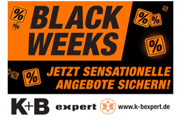
Create contrasts!
Attention through achieved contrasts
© K+B E-Tech GmbH & Co. KG
An important component of a poster are the colors used, which have different effects on people (e.g. red = signal color / very conspicuous, green = natural effect, yellow = lively / warm). Green = natural effect, yellow = lively / warm).
Here it is important to know that it is not the amount of colors that attracts attention, but the contrasts achieved.
.
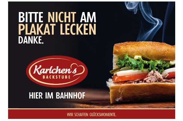
Awaken emotions!
Triggering desire in the viewer
© Karlchens Backstube
A poster should trigger emotions and desires in the viewer. From the desire to go on vacation to the absolute desire to purchase the product directly -> “Call to Action”.
Like a cold drink on a hot summer's day or the delicious pastry here. The more/greater the emotions triggered, the longer the poster/message remains in the viewer's memory and triggers the expected “call to action”.
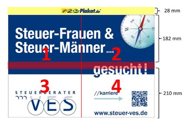
Position of the picture!
Pay attention to the placement of the image!
© VES Steuerberater
Posters are printed in a 4-piece pitch. The adhesive ensures that the parts fit together as precisely as possible during gluing. Pasting with absolute millimetre precision is very difficult.
The trade association for outdoor advertising and the partners involved, such as poster companies and printers, therefore point out, that the 4-part division of a motif should not go through critical areas, such as faces, important texts or QR codes.
Frequently asked questions about poster design
- Why is the choice of colors important in poster design?
The choice of colors influences the mood and perception of the poster. Colors should be chosen to match the message in order to evoke emotions and improve readability.
- How to evoke emotions through poster design?
Emotions can be evoked through the use of images, colors and design elements. The choice of elements should match the desired emotional response.
- What role does the target group play in poster design?
The target group influences the entire design of a poster, from the colors used to the choice of images and text. The poster should appeal to the needs and interests of the target group.
- How should a successful poster be designed? A successful poster should have a clear message, be well structured, have a suitable choice of colors, present the company logo visibly, use contrasts, place images cleverly and use the space efficiently. It should also trigger emotions and appeal to the needs of the target group.